Perception

Perception as a cognitive process is how we, as humans, receive information about our environment. The whirring of a fan in the background, the feel of the keys on your keyboard going down, the sound of them clicking and clacking in response to you pressing them, and the smell morning dewdrops coming through the windows are all examples of how one uses their various senses to gather information about their environment everyday. Perception works alongside other cognitive processes such as attention, memory, and language to give meaning to all of the information being given to us at any moment. (Preece, Rogers,& Sharpe, 2015, p. 70)

When considering Perception through the lens of interaction design, we’re considering the best ways in which to present information to the user. How we present information should be easily recognizable across multiple mediums, and having two or three methods of conveying the same information to ensure the meaning is properly conveyed is important (Preece, Rogers,& Sharpe, 2015, p. 71). For example, consider your phone. When you receive a call or a text message, how does your device present that information to you? On most devices, the screen will “wake up”, visually indicating that there is something that requires your attention, while at the same time playing a ringtone, giving you an auditory indication that you have a notification, and lastly, most devices will also vibrate, giving you a tactile indication that you have a new notification.

But then what? How do you know which notification you are receiving? If you’re receiving multiple notifications how do you tell them apart? Like I talked about in my last blog post, Icons as metaphors are important for this, but else can a designer do to make sure if you get both an email and text message that you can easily see which is which, and quickly check which is more important at the moment?

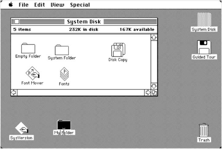
If you’re like most people, you have your phone on vibrate most of the time, so auditory feedback is out, but visual feedback is the key. Using blank space to separate information and using borders to section it off, is the route most smartphone interfaces take, and it’s the route largely recommended by research and those with experience in the industry (Preece, Rogers,& Sharpe, 2015, p. 71).

Presentation of information has been a topic of interest for me for a long time as I study Game Design, and look into what good game design looks like. Often, efficient and clear presentation of information is one of the most critical parts of designing a game that people will enjoy playing, and seeing some of the theory behind how information should be presented was great opportunity to learn more about a fascinating topic.

References

Preece, Rogers, & Sharp, (2015). Interaction Design: Beyond Human Computer Interaction. West Sussex, United Kingdom: John Wiley & Sons, Ltd.

Interface Metaphors

Interface Metaphors are one of the ways in which we make systems more intuitive for users to use by referring to a function of the system using something the user is probably already familiar with (Preece, Rogers, & Sharp, 2015, p. 45) . These metaphors are kind of like shortcuts, by which we are able to quickly and concisely convey information about how the user should approach and interact with our interface

Interface metaphors are one of the most common and recognizable ways in which we design technology to be more intuitive. A computer’s “desktop” and “recycle bin” are both ways in which we use familiar language in order to convey a quick concept to users. A desktop isn’t literally the top of a desk, and there is no actual recycle bin, but with those words, users immediately know the intended function of each feature, as it is similar to an actual physical desktop and the trash bin the user probably has beside their desk.

Throw in “bookmarks”, “folders”, “shopping carts”, and any number of other ways in which we do this, and it becomes clear that using metaphors to describe the tasks certain features accomplish is almost second nature at this point (Preece, Rogers, & Sharp, 2015, p. 47) . Without these metaphors, it would be much more difficult to quickly understand how one might be expected to use these various technologies.

The Folders and Trash Bin in this old Mac Interface are early examples of how Interface Metaphors were used to quickly describe the functions of a system.

Personally, I never considered how prevalent the use of metaphors was in interface design. Growing up around computers and having one from a very early age, the digital versions of folders, desktops, and the like were almost more understandable than the physical versions as I was introduced to both very early in my life. Thinking about this and how more and more young people are more familiar with the digital version of these metaphors than the physical versions, I wonder how use of these metaphors might adapt and change going forward. Language and its intersection with Technology is always fascinating and seeing both evolve alongside each other is fascinating.

References

Preece, Rogers, & Sharp, (2015). Interaction Design: Beyond Human Computer Interaction. West Sussex, United Kingdom: John Wiley & Sons, Ltd.

What Is Interaction Design?

Interaction Design is the process that we go through when trying to minimize the negative aspects of interacting with a given system (Preece, Rogers, & Sharp, 2015, p. 2) and create a product that that supports and enhances the way people carry out their lives (Preece, Rogers, & Sharp, 2015, p. 8) In simpler terms, it’s how we make products more intuitive and less frustrating for users.

Interaction Design is one of, if not the most important part of designing almost any piece of hardware or software. While it is definitely possible to use poorly designed products, it’s both frustrating and inefficient to do so even if that product is entirely functional, in that way, time spent now to ensure a product is designed properly can lead to countless hours saved through efficiency, and designing intuitive systems is nothing short of an art, and one that should be appreciated.

That being said, while I may gravitate toward the more nuanced and artistic sides of Interaction Design, it’s important not to ignore the science behind it, the user experience is made up of many different components, and psychology, sociology, and engineering all factor into the final product (Preece, Rogers, & Sharp, 2015, p. 9), and these are all part of the broad term that is Interaction Design.

One thing that has struck me throughout the first chapter is that there is no one “right way” to approach interaction design. Every decision that goes into the design of a product whether it is hardware or software, is based entirely in context and design that is good in one context, such as the time in which it was made, may be a bad design in another context. So rather than learning right or wrong, what’s good and what’s bad, to learn interaction design one has to learn how to adapt to the context of the situation. In that way, Interaction Design is almost an art, more than it is a science, and the nuance that goes into it is probably my favorite thing about the topic so far.

References

Preece, Rogers, & Sharp, (2015). Interaction Design: Beyond Human Computer Interaction. West Sussex, United Kingdom: John Wiley & Sons, Ltd.